Art Directorate
Visual LawDesign MemoryGraphic Intelligence
Visual decisions begin with the buyer reading. Operendia studies status cues, category codes, screen behavior, and sales use, then gives the brand images fit for commerce.
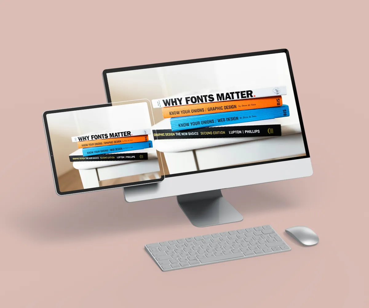
Art Directorate
Art Directorate at Operendia is the house's visual court. Brand language needs a body people can see. Strategy needs form. A company's market case needs images, pages, interfaces, decks, symbols, icons, layouts, and typographic choices able to carry meaning under public pressure.
Operendia treats visual work as business language. Logos can spark memories. A website screen feels trustworthy. The brochure proves it. An interface carries user patience. Campaign images carry the first public signal. The way text looks can signal status. Layout carries reading speed. Color carries mood and category expectation. The Art Directorate gives these parts a single visual judgment.
The department begins with the question behind the image: what should people understand at first sight? A business can lose authority through poor spacing, weak hierarchy, inconsistent fonts, shallow imagery, or visuals that are not aligned with its real market role. Buyers may struggle to explain why trust feels low, yet the eye makes its decision fast. Operendia reads that decision.
Art Directorate works closely with Brand Architecture, Market Strategy & Perception, Web & Digital Engineering, SEO - Search & Content, Performance Media, and Film & Motion. Brand Architecture gives the verbal world. Market Strategy & Perception gives the buyer reading. Web & Digital Engineering gives screen reality. Search & Content gives page intent. Performance Media gives ad pressure. Film & Motion gives movement. Art Directorate makes those ideas show up visually.
The work covers visual identity, logo systems, UI/UX design, typography direction, presentation design, website visuals, campaign images, brochure design, PDF systems, icon sets, interface logic, layout plans, and print material. Digital screens and physical documents share one eye. Nothing feels accidental. Nothing behaves like a random asset from a stock folder.
Design at Operendia must help sales. A proposal needs a hierarchy that people can follow. A pitch deck needs visual confidence. A website needs pages that guide the eye. A campaign image needs to be fast-reading. A logo needs memory power. An interface needs calm use. Social assets need the brand's tone, not decoration. Brochures need proof that people can carry into a meeting.
Art Directorate also protects the brand from visual drift. Teams often add new assets as the company grows. Decks multiply. Pages appear. Ads change. Documents travel between departments. Interfaces gain new modules. Small visual decisions begin to weaken the brand's public reading. The visual system from Operendia stays true to the brand's initial market approach.
The department's craft lives in restraint. Strong visual work does not need noise. It needs proportion, hierarchy, tension, spacing, rhythm, and commercial sense. It needs a designer who understands why a buyer spends more time, why a founder needs a stronger deck, why a sales team needs proof at the right size, and why a website must feel credible in the first seconds.
Operendia's Art Directorate gives brands a visual language fit for rooms, screens, search pages, proposals, campaigns, and memory.
The eye enters the brand first.
That entry is included by Operendia.
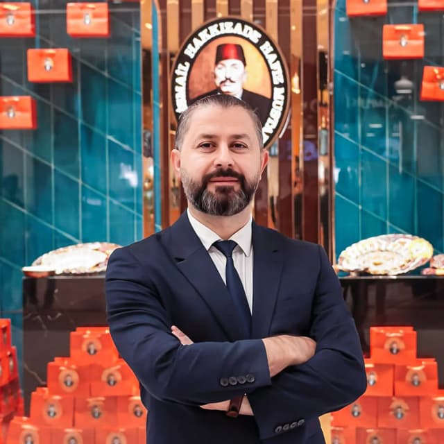
Ahmet H. Demir
Global Markets Managing Director, Hafiz Mustafa 1864
We had been following Operendia's tactics and digital strategies and determined they had a high level of expertise in the creative and online arena. Operendia is definitely the agency to lead us into the digital space. They are technologically savvy and have excellent communication skills. I hope to work with Operendia for many years to come.
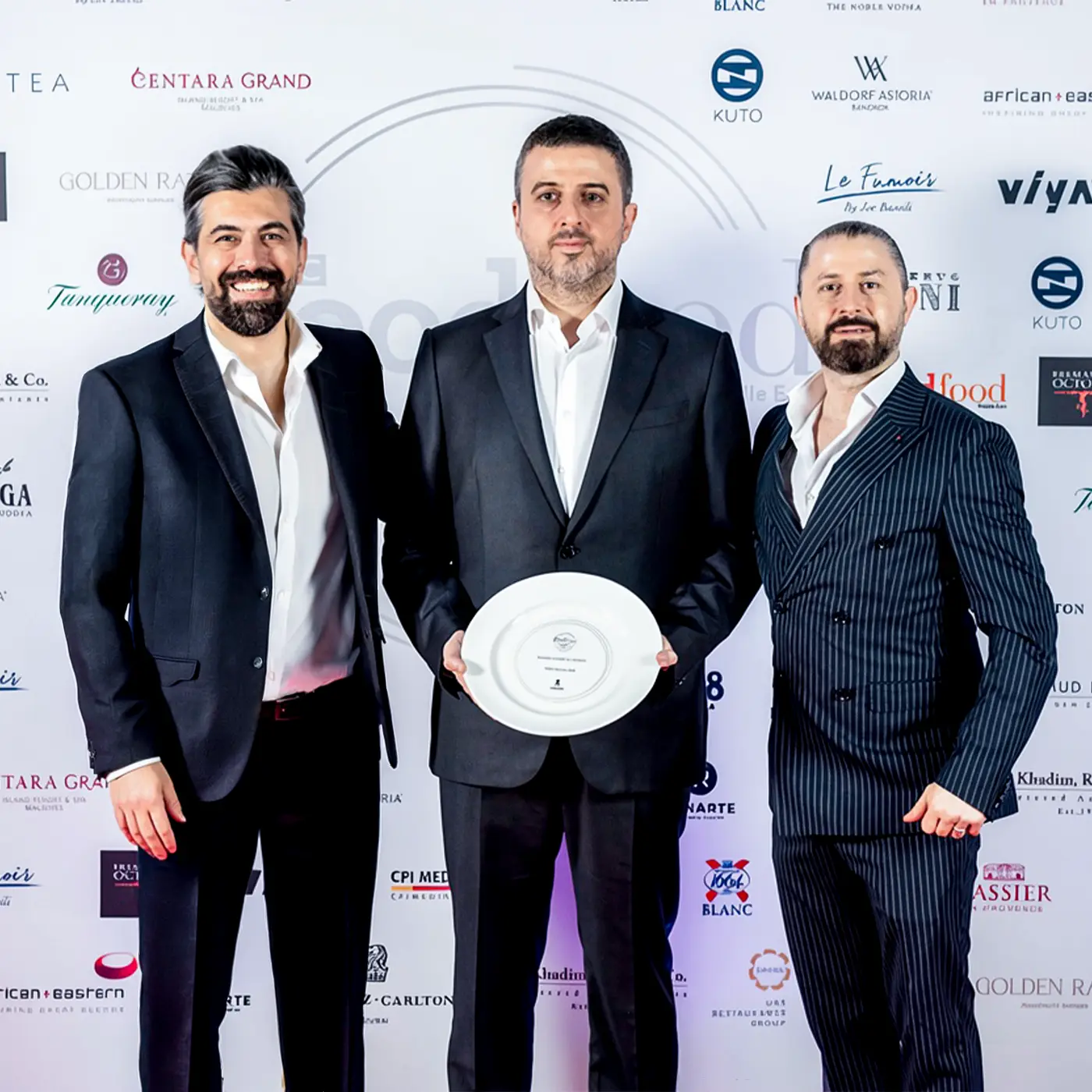

Asil Ersoydan
CEO, SEG
Operendia managed our entire digital infrastructure with exceptional expertise, including our ticketing infrastructure, mobile app, universal backend, and all digital processes. Plus, they did an amazing job with our branding, design, logos, copywriting, and SEO. SEG got a solid digital base and a noticeable brand thanks to their work. Operendia's skills in this field are truly ahead of their time. I am very fortunate to know them.

Ahmet Cinar
Managing Director, Cinar Rugs
Operendia's creativity and thinking style are above any agency I have seen. I have worked with them for many years on corporate communications, branding, and composition. Their project management, design studio, and creative team are all top-notch. Innovative work, always accomplished on time with excellent results.
The Operendia Ledger
Read market signals, brand thinking, web intelligence, search notes, and creative systems written for people who build passionate enterprises.

 Make your brand matter.